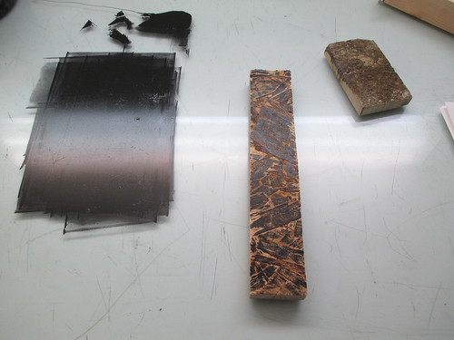
13 February 2014
Front Row Society Submission: Artisanal Botanist
Some exciting news! I spoke to my beautiful friend Katie over Christmas (she does Surface Pattern at Leeds), and she told me about Front Row Society, who run competitions on a monthly basis specialising in fabric prints. For me, it's just a great encouragement to do something for myself every month, and hopefully it will pay off! So here's my Venus Fly Trap design, based around the given theme, Artisanal Botanist. It sticks out like a sore thumb amongst all these flowery mirror-y digital prints but, I hope that's what will give me a chance of being noticed! I may also do a couple more submissions last minute tomorrow with the same illustrations... GAH so exciting!
The prints are chosen on basis of merit, but each print is voted on by anybody, which increases the chance of it being seen! So I would really really appreciate it if you could vote for me! And of course, any other prints that you think deserve chances of winning.
Votes are made HERE and starts on the 16th February until the 28th!
Thankyou!! It would mean the world to me if you voted for me, it is my first go but one of my resolutions was to get stuck into some competitions this year while I have the chance! So I will be doing these every month, or at least every competition that I think has some steam for me.
Labels:
Design,
Fashion,
Illustration,
Surface Pattern,
Vivien Chan
Kingston University: Experimental Life Drawing, Brian
This is Brian, our very enigmatic life model. I decided to do some painting this week, because I hadn't held a brush in so long that I fancied a challenge. It paid off I think! I particularly like the first one, but I think I'll add some more to them when I put them in my portfolio. This is the first time I've properly really gone into character, and I much prefer using life drawings as a means of getting that across. I'm not so good at human characters from my head, or any human-like figure really, so it feels like a step in the right direction.
Labels:
Design,
Illustration,
Kingston,
Observation,
Vivien Chan
Martin Creed, 'What is the Point of It?'
An exhibition review for my research portfolio. Enjoy!


And here's Hannah and Ani being cute and having fun.
Labels:
Exhibition,
Practitioners,
Thoughts,
Trips
05 February 2014
Kingston University: Talking Heads: Sarah Dyer
This week we had Sarah Dyer come in to talk to us about children's book commissions and advertising. She graduated from Kingston in 2001 and actually had published a book in her second year at University. The difference between publishing jobs and editorial is mostly the relationship with the client; publishing requires quite a lengthy relationship and the process is quite long which Sarah says she quite prefers. So far she has published 7 books all over the world in many different languages. She tends to only work with one or two publishers at the same time, because otherwise she would end up competing with herself. Her first book was published with Bloomsbury Books, importantly pre-Harry Potter at this stage. The relationship and types of story they were looking for changed after Harry Potter, and was also affected by the recession; many publishers wanted to play safe. Her book was seen through arrangements at Kingston. She tends to use her sketchbooks and dummy books as her 'portfolio' which is unusual but quite canny, as it is more inviting for the client. They want to be as much part of it as you do. Publishers are also looking for characters with potential for series, and sustenance on all sides and points of view.
'Batty' the book shown above, was rejected by Bloomsbury and published by Francis Lincoln. These two are her two main publishers. Sarah advised us to 'pick our battles wisely' because at the end of the day, marketing and sales are your allies. They need to sell this book as much as you do! You generally are met with two people: the Editor and the Art Director. The Editor helps you with your text and storyline, whereas the Art Director helps you work out layouts, and agrees on how the imagery works. For example, parts of Batty are printed upside down to show his point of view, and the art director helps decided on continuity which pieces of text or image are placed upside down.
When you pitch, you take sketchbooks with developments and dummy books. These dummy books might be edited again and again until a final is agreed upon. A standard book is 32 pages, which included the front and back cover. Boulogne book fair is THE book fair for children's books, and is the gateway for your book being coeditioned in other languages. The fee that publishers pay you is the right to PUBLISH not to own. Your work remains yours.
Sarah has just taken up a new project in Advertising though, making artwork for animations for Cushelle. It is a totally different way of working, and is an extremely fast turnaround in comparison. You are a small, but important, cog in a much bigger system, so you don't get to make so many decisions. She also has to use their colour ways. However, somehow they become animations from all the pieces she sends! This project lasts for a year, an episode every month.
Her advice for us on children's books is read your stories out loud. You'll never really see it as a whole until you do, so it's worth reading it to someone and hearing yourself helps to take yourself out of your illustrator head. Seeing it from afar can help you make the right adjustments to make it flow. And also, make sure you give your creations worth; it has to be important to you and protect your story!
Labels:
Design,
Illustration,
Kingston,
Practitioners,
Thoughts
Kingston University: POP Project and In the Making Exhibition
This term is probably the most exciting for me, mainly because we get to do a lot of making. Our big project this term is the POP Project, Print and Object Project. Obviously I was screaming inside, because print and object are possibly my most favourite things in the world. Its mainly process (YAY) so it's not necessarily that I have to come up with a concept straight away.
We were advised to go and see the new exhibition at the Design Museum called In the Making. It's really worth going, and the whole museum has great exhibitions on at the moment (PAUL SMITH!). Despite the kind of annoying spot lighting, I thought the exhibition was curated really well and I liked the objects they had decided to show. Very normal, sometimes mundane objects were shown, and yet the objects became something else!
I actually would quite like a piece of tennis ball felt for myself actually.
For this project I really wanted to use wood. After visiting Jonas' family in Germany, with an enormous collection of woodcut prints in their library no less, I've become a little bit obsessed.
So far my research has just been in collecting, although I plan to do some more. This is definitely something I want to pursue long term, so it's been pretty great so far getting to do this for a whole project that is 8 weeks long!
Since then, Ani and I have been hacking at fallen trees, collecting twigs, mostly in torrential February rain. But I'm hoping to get some more printing done soon! I'll be sure to keep you all posted.
Labels:
Design,
Exhibition,
Illustration,
Kingston,
Observation,
Vivien Chan
Kingston University: Paper Project with Owen Gildersleeve
We had a week long project with Owen Gildersleeve using paper. Our brief was based around three themes that we could choose from: Discovery and Innovation, Fantasy and Fiction, and Life and Death. I decided to go for Life and Death, as it just seemed to go with the ideas I had at the time.
When I think of paper, I instantly think of everyday, generic white paper. White is incredibly symbolic in Life and Death all around the world, so I thought it would be interesting to make a piece around that. In Western culture, people tend to mourn in black, where in many Eastern cultures they mourn in white. White lilies are customary tokens at Western funerals, where white flowers in parts of Asia as gifts are very ominous and symbolic of bad luck. After talking to my tutors and Owen, I decided to use white flowers to convey Life and Death. Owen also suggested singeing the petals to add the element of death, but then I thought of the tokens in Chinese culture, where paper objects are burned with the deceased as gifts to heaven. Perfect right?!
We had to hand in photographs as our final piece to our work. I decided to film and photograph mine as the film has a very sobering effect. I'm very happy with this project, and many seemed to really enjoy working with a new medium. For me, I'm just thoroughly enjoying making, and I look forward to more! My set up was a windy corner of our garden, several sheets of A3 white card, and a lighter. Not ideal conditions this time of the year but I wasn't prepared to burn the house down! I'd made something like 10 flowers, and had burnt some to a crisp in a test went wrong in the porch (don't worry, nothing/nobody got hurt), so I only had a few left to play with! But it turned out pretty well, and I'm really happy with how it went! The last photo is the one I submitted, and I've also posted up the film on Youtube here.
Labels:
Design,
Illustration,
Kingston,
Vivien Chan
Kingston University: Talking Heads: Daniel Boyle and Maggie Li
Danny graduated in 2008, and did Illustration for two years before swapping in the last year, after being encouraged by a friend. After leaving Kingston, he moved home and he and 5 other Kingston alumni formed Treat Studios as a means of keeping in touch, but more importantly for Danny made him move back to London. The collective was based on friendship and of course a certain degree of standard. It took time to work out how to work together, but after being paid well for a more dull commission, they have since done work that was more free. Their most popular works have been for E4, for their Slackers Club adverts, and for Skins. They worked more like an animation studio, but the work ethic wasn't quite collaborative; often the more popular styles from individuals would be the selling point of Treat, and so soon personalities could get drowned out by others. Much like Margaux, charity work was much more challenging and interesting, and they found that within a collective that they could make a piece very quickly and efficiently together as a group. Individuals began having bigger projects and started to shrink. After a trip to Berlin with Etsy, the group withered, and many members moved away. Soon after, Treat almost folded and Danny almost gave up. But he and another member Alex re-collaborated now are starting up their own animation studio. Now they are working more into motion graphics and special effects.
I was particularly keen to hear from Maggie. We had wanted to speak to her from last year when we went to speak to Joely from Zombie Collective, and we really admired all of the members. From seeing what Maggie does within illustration, I was really looking forward to knowing how she got there. Maggie graduated in 2010. The girls set up Zombie to encourage all of them to work, as they had all moved home after graduating. Between the 5 of them, they have a really diverse range of skills, which helps with the array of things they can do. They are most well known for their workshops and events, among them being a show 'Fathoms Deep' and the Hayward Gallery, and workshops at Tate and the V&A, 'You have to work on blending your work together'. She sees that being in a collective makes you a much more diverse creative person, defining you as a person beyond your work is very important. She currently is a freelance illustrator, but most of her time is working as an art director at OKIDO magazine. When she left home, she took two internships, one at Random House and the other at OKIDO, which was still very small at the time. OKIDO now is in the process of becoming a children's TV series. She feels that her freelance work has been more informed by doing work with both OKIDO and Zombie. The collective has been a supportive platform for her and all the other members, and is perhaps a different way of working than other collectives.
Again, it was great to hear from two people about struggle. More and more people are coming in being reassuringly 'real' in that they just come across as someone who I could have graduated with. I'm glad that these people are so relatable, it feels much more like I have a shot!
Labels:
Design,
Illustration,
Kingston,
Practitioners,
Thoughts
Subscribe to:
Posts (Atom)