Showing posts with label Thoughts. Show all posts

30 December 2016

Rejuvenating the blog.... where have you been Vivien??!

While it is always common for me to start with apologies, I will refrain from doing so this time to save you from having to eye-roll and listen to the 'I've been busy' blah blah. It's still busy, as always, but it's about time that I give myself room to have some 'me' time to write this blog. I think with all the reading and writing, and getting square-eyes looking at a screen, I've been totally exhausted starting out this dissertation journey.

So a humongous catch up is in order, preferably less reviews, and more own work! Because there is a lot of it to share, and it won't be particularly chronological, but if I can catch up in a few posts then at least there is that peace of mind. I will endeavour to post at least once a week, as a way of having something else to think about aside from street food hawkers, Hong Kong and job-seeking (gah!). It can be, once again, my re-newed annual New Year's Resolution.

Each post is going to represent each month that has flown by, starting in August, when the last post was published. Hopefully then we can get back to a speedy recovery! Wish me luck!

Here is a pic of Julian Stair's ceramic tools, an inspirational metaphor for how organised I wish to be in the coming months.


15 August 2016

Yelena Popova and Michael Beutler at Nottingham Contemporary

It might be summer, but it sure hasn't been a holiday so far (sigh), so actually coming back to the blog as a sure-fire way to release some thoughts, and hopefully, shake off the fear of dissertation work. Who would have thought that a two month break away from readings and writing would be so tough to return to?

Anyway, my sole week off in the last few month or so was spent at home, playing a lot of video games, being fed by my family, cuddling kittens, but also some excursions to visit Katie. One way to redeem myself before heading back to work was to visit the Contemporary's new show; after being so impressed with the previous Simon Starling show, I hoped this one would be just as engaging!

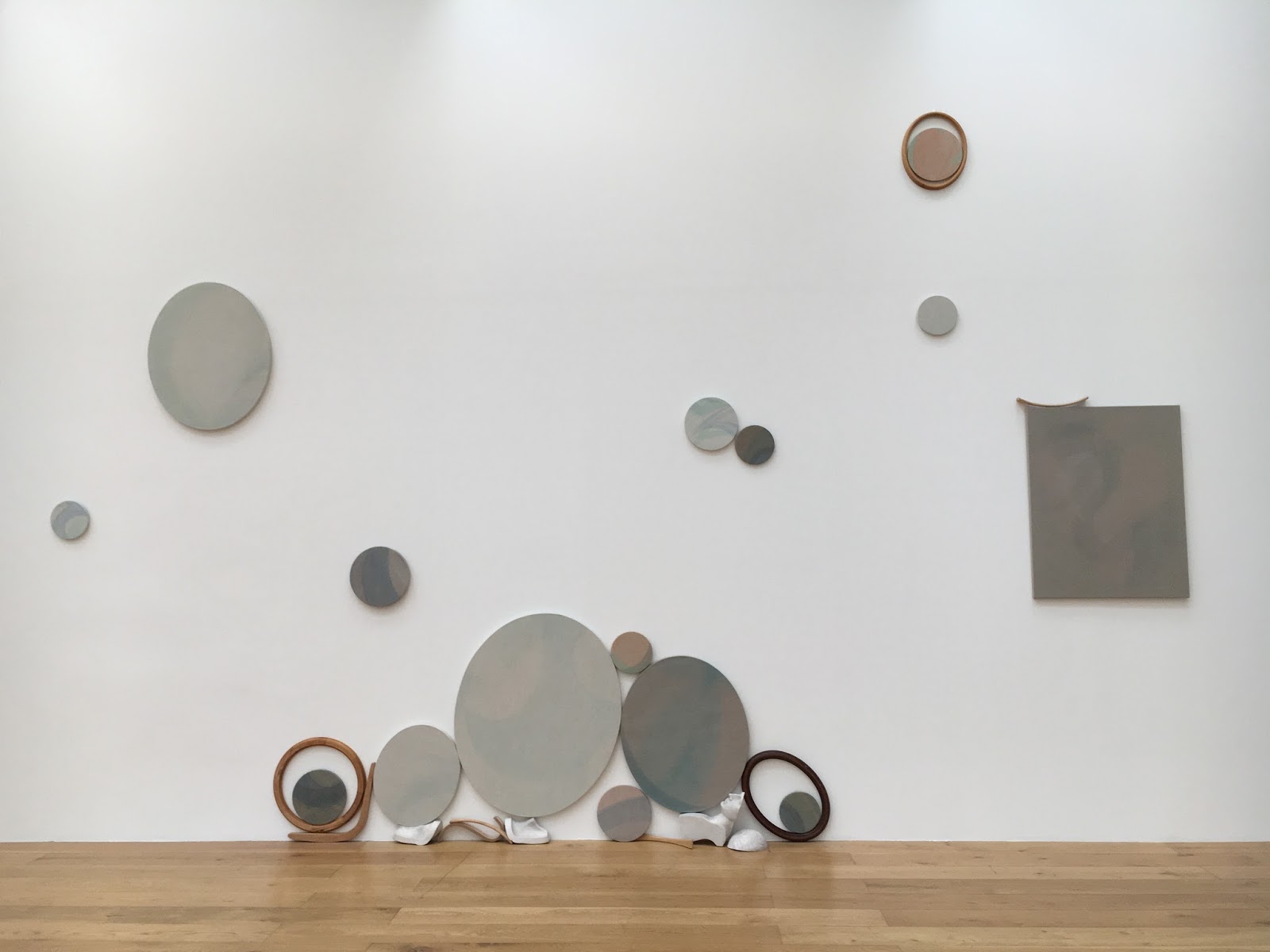
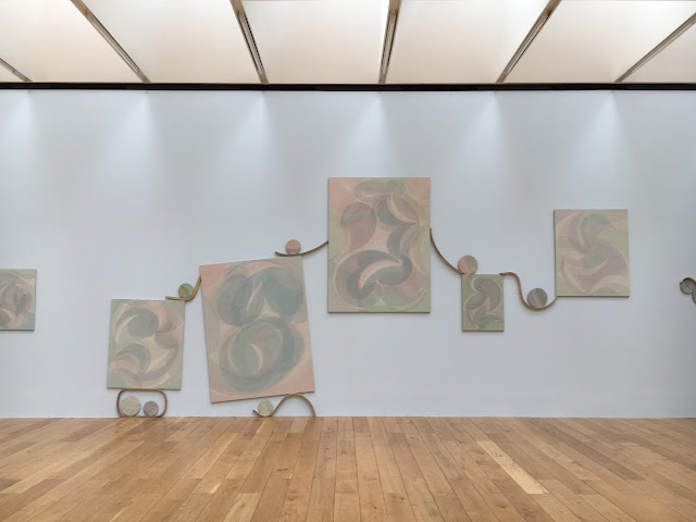
This time, the galleries had been split between two artists, local artist Yelena Popova, and Michael Beutler. Katie and I started off with Yelena Popova in Gallery; In the first room Popova used a combination of mixed media, using sound, video, painting and installation. However, the star piece was in Gallery 2 debuting Popova's piece called After Image. The installation was made up of a series of large paintings, and an assortment of smaller paintings on rectangular, circular and ovular canvases. The concept alluded to the life and death of images, and the expectation of the audience as constant voyeurs of images. The paintings were created from light pigments on heavy, dark canvas, making the pictures seem faded, or as Popova describes them, evaporated. In the light of the room, the paintings 'emerge or withdraw', bringing out a sense of of an almost ghostly energy.

The installation felt very fresh and simple, and quite frankly was absolutely beautiful to explore. I was less inclined to the images, but more interested in the collection as a whole, cleverly strung together with supple pieces of wood holding the paintings in the balance. The one pale blue wall brought a warmth to the pinks and greens in the paintings, and against the three other white walls evoked the feeling of the sea, the pieces as eroded rocks and shells, and weathered pieces of drift wood. It was very easy to get lost in the details of it, and charmed by the clusters of earthy objects. The piece was quiet, comfortable, and as you can see in the many Instagram photographs, ironically easy to make beautiful images from. 


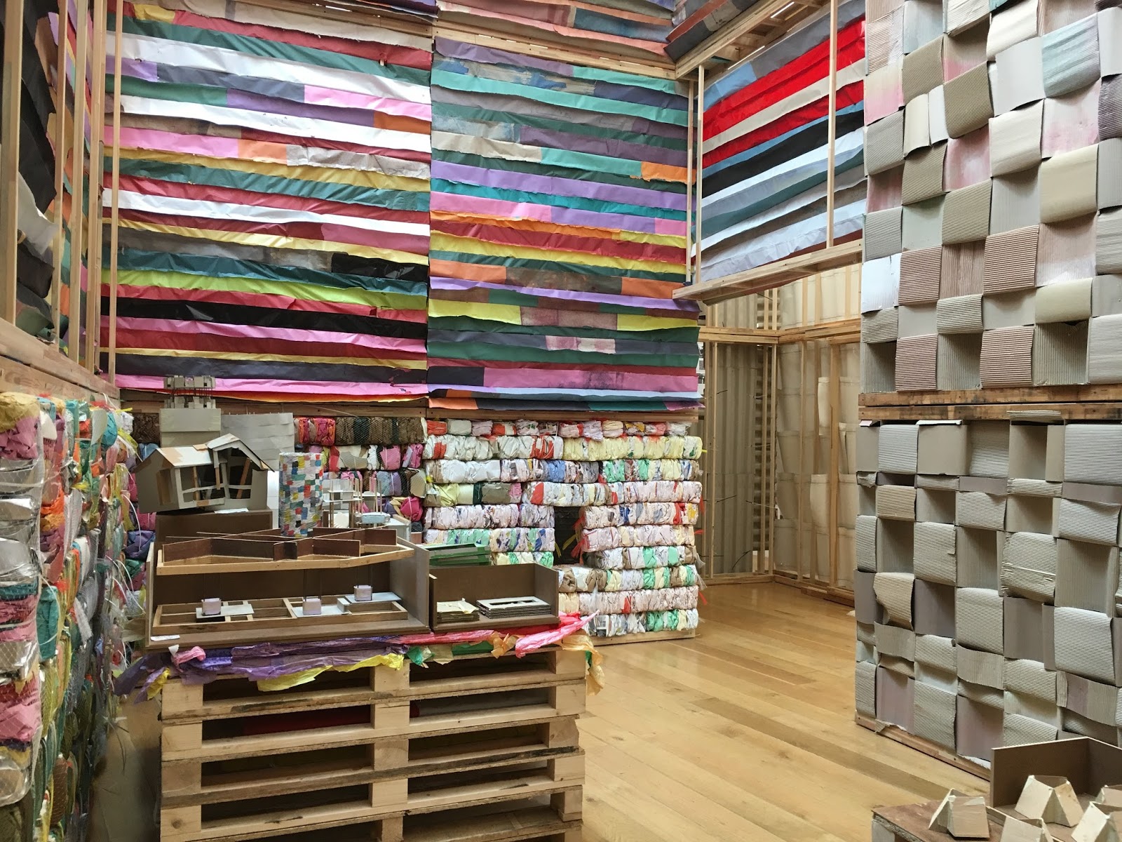
Next door, Michael Beutler was a complete contrast and so an energetic explosion for us. It was the first time I had been to a more interactive exhibition at the Contemporary, and it was a great way to use such a large and bright space. Beutler's work is colourful, inviting and exaggerated, transforming what can be, and often is, a more serious white-cube style gallery, into a playground. The work was made of several makeshift walls, made of a variety of materials; coloured paper, plastic, cardboard, and fabric were all involved. Inspired by traditional Japanese paper walls, the interiors looked as though it was the artists studio, left to rest at the weekend. We again played voyeurs, finding tools, notes, buckets of glue and makeshift machines, used to squash, fold and shape paper into bricks or giant squiggles, or oversized paper waffles dotted around the installation. We enjoyed the aestheticism of the colours, textures, and haphazard placements of so much stuff, bits of paper taped to the walls, string and remnants scattered around that doesn't look far from the mess of my desk at home. The comfort that Beutler gives is one of a childlike daring, where anything is possible. Where Popova's installation is reflective and contemplative, Beutler's is spontaneous and unhindered by the anxiety of age and expectation.


Again I was thoroughly impressed with the show, especially involving a local artist. I enjoyed the pairing of the two practitioners, contrasting in colour, density and interactivity which clearly had been  thought through for the local audience in Nottingham; as the school holidays have begun, what would be more enticing and intriguing than a giant green paper waffle in the window, and the peace and cool temperature of a gallery? From a design history perspective, I enjoyed the way that the exhibitions highlighted each other, and both artists displayed their process as an important aspect of their work. As two very tactile exhibitions, I appreciated that the outcomes were more than just the aesthetic value of their work, which will always look impressive in pictures, but beyond that is about interacting with the work in the space. The exhibition served two kinds of exploration; a truly experiential installation that transfers you into a world of oversized fun and colour, and the layers of meaning we find in creating, looking and documenting images. Looking forward to the next one, Contemporary!

11 June 2016

Yayoi Kusama at Victoria Miro Gallery


A short little post about this one, as I'm sure you've seen it all on Instagram, but at least you get a cute/rubbish selfie of me and Hanswan.

We somehow managed to squeeze in visiting the highly anticipated Yayoi Kusama exhibition, at the Victoria Miro Gallery in Old Street. As far as I know it's new works (I'm not really a Kusama expert, but I love spots, pumpkins and red wigs), and although there were only a few things there, Hannah and I enjoyed ourselves without having to endure a crazy queue! Top tip, get there for 10am on a Wednesday morning and you get the whole effect without the Disneyland queues.

Of course a highlight was the glowing yellow pumpkin room that everyone is taking selfies in...we got a whole 20 seconds which is well enough time to take an alright selfie, although I'm not great at them. Obviously it's only a teeny tiny box, with a little corridor bit for 3 people maximum, and then lots a great pumpkins surrounded by some very effective mirrors. Fantastic kawaii factor.


What was also lovely was that there was a few outdoor works (although one of them got flooded by the crazy storms we've had recently...) and although it was a bit smelly, I enjoyed the effect of all the floating silver balls in the pond. I loved the texture of the green spotty algae in the water and the reflective silver, and no doubt the effect was to emulate the spots that she uses in her work. I can imagine this as a beaded jacket don't you? Matt green sequins and giant baubles would be great...

Then last but not least, there were some of her paintings upstairs, overlooking the garden and the surrounding flats. They were mostly the textural sort, mirroring the baubles and confetti algae on the pond, but also to finish off, a lovely golden pumpkin painting.

I mean, I'm sure all of this has some kind of conceptual monologue. But with all things considered, I love the fun of it all, and after hearing some of the Japanese artists at a talk late last year for the Kawaii exhibition out in Farnham, I can relate Kusama's work to this timeless, transcendental concept of kawaii. What I admire about it is that it is beautiful, colourful, and wonderfully consumable. It doesn't have to be something with 'meaning' beyond its beauty and pattern, its just wonderful to be around and frankly, makes me very happy. Shame that I couldn't really get anything in the shop, never mind.


Simon Starling at Nottingham Contemporary

It's been a long time, although its the end of the year, I've been doing a lot of things recently so yet again the blog goes on the back burner. At least now that the two blogposts for Design China have now been posted, I feel a little less guilty for not blogging so much. It feels great to write for another platform, hopefully I get to do more in the near future.

But in between all of this stuff, I've visited a few exhibitions so I thought I'd write about those as a breather for all the other bits and bobs I'm doing.

In the midst of it all, I managed to squeeze in two days at home to visit Alex and my parents. Walking up from the train station in Nottingham, I thought I would pop into the Nottingham Contemporary, just because. I was not disappointed! The museum was holding a Simon Starling exhibition, who although I didn't really know much about him before, I left absolutely loving the work on display there.


The first room was dominated with two huge silver blobs, which beautiful in their own right, blew my mind once I'd read label for the piece (I believe a lot in labels). The two tiny photographs ion the back wall puzzled me for a while; the photographs are of Chinese migrant workers outside the Sampson shoe factory in North Adams, Massachusetts in 1875. The big blobs turned out to be representing two silver particles from the cut outs of these two pictures, blown up a million times. The two objects were made of forged stainless steel from Nanjing, before being shipped to Massachusetts to be exhibited at MOCA.  

Immediately I felt like Starling was 'one of us', a design historian in his thinking through objects, images and history. I love that his work is encompassed by lots of different pieces, filling up the space with narrative and a reflection on processes. The contrast between the two tiny photographs and the two enormous sculptures really excited me for the rest of the exhibition. I felt it was crucial that the photographs were a part of this first piece, 'The Nanjing Particles', clearly pinpointing this group of minuscule people in the photograph as a part of history to discover, delve into a recognise. Not only are these objects beautiful, but also socially important, there is a clear message here that is to do with people and their place in history.


The second piece that stood out to me, 'Red, Green, Blue, Loom Music' focuses on the weaving processes that Starling documented at the Antica Fabric Pasamanerie Massia Vittorio in Turin. Behind hanging threads showed a ten minute video documenting the process of weaving from the threads to fabric. In the main room stood what looked like a piano and several object hanging from the walls; it turned out that the piano was actually a pianola, a self-playing piano that uses a reel of punched paper to play. On the walls was a piece of sheet music, called 'La Machinna Tessile' (The Loom), a reel of punched paper for pianola, slatted Jacquard punch cards, and two reams of fabric.

It was exhilarating to connect the dots - During his visit to the factory showroom, Starling found the piece of sheet music on a baby grand piano, 'La Machinna Tessile' by Rinaldo Bellucci, inspired by the machines in the factory. After listening and recording the music, he transferred the music into a reel of punch cards, which produces the pattern on the two reams of woven fabric (from my limited knowledge of weaving, its the front and back!). These punch cards were then transferred into pianola music, bringing the process full cycle, from music, to textiles, back to music again.

This exhibition is an absolute dream for me, and I'm sure if HoD went on a trip to the exhibition we would all be going wild with inspiration for our own work. The whole time I was thinking 'this is so history of design', especially after our first exhibition Reimagining Objects in response to our object essays. As much as I believe our practice as design historians is about research, its also about being able to express that research, through writing as well as through objects, curation, making and collaboration. One thing I would absolutely love to see is Starling's process, his sketchbooks, writings and note throughout his process of making these works. I will definitely be looking out for more exhibitions like this!

If you're around the Midlands, go and see this before it's finished! At the Nottingham Contemporary until the 26th June.

London Craft Week: Wang Dongling Calligraphy Performance

This post was written for the Design China blog, which you can see here.


On the 6th May, The British Museum welcomed the world-renowned calligrapher Professor Wang Dongling for his first public performance in London for this year’s London Craft Week. Taking centre stage in the Great Court, four rolls of paper were laid and taped onto the marble floor at the entrance of the museum, where a crowd gathered in wait of a performance by ‘China’s greatest living calligrapher’.

            Wang took a slender brush in his hand, a sixty-centimetre-long bamboo handle with a short drop of hair, and dipped it into a red bucket. He wore an all-black outfit with bright red socks, matching the bucket of ink. Beginning in the top right hand corner, Wang starts to paint; he holds the brush but the very end of the handle, his body in a constantly hunched position, knees slightly bent. After a few characters, written vertically on the page, Wang walked back up towards the bucket to re-ink his brush. The pace is efficient, confident, perhaps less sentimental and more calculated than I imagined the process to look like. The ‘mad cursive’ script is difficult to decipher – the characters become abstract lines and gestures, pulling out the traces of the body from the painting.

            We were lucky to witness such a large piece. In contrast to his wild, heavy works with enormous brushes, finished in one swooping round of black, this piece felt bird-like, fluttering and dainty with its small characters on a vast page. This piece took time. A meditative hour was created in the hot and noisy atrium, with Wang solely concentrated on the calligraphy as we looked on in awe. He didn’t even stop for water. The lines fade in and out of focus as the ink dries on the brush, forming an undulating surface from the paper. The occasional swift flick of the brush for elongated characters surprised the audience, bringing his movement back into focus.

            As he came to the end of his performance by signing the piece in the bottom left corner, a round of applause echoed through the hall. He went to the microphone – he smiled and told us that the script is the Heart Sutra, and that the piece is meant to be seen as both calligraphy and abstract painting. While the piece lay out in the bright light to dry, we walked around it in reverence to what he had just seen; Not only had we observed the product of a master maker, but also the dance of his craft.

01 June 2016

London Craft Week: Contemporary Chinese Craft

This post was written for the Design China blog, which you can see here.


As part of this year’s London Craft Week, the China Design Centre hosted two exhibitions displaying an array of work by both established, and up-and-coming Chinese practitioners. The gallery space is hosting one of them; ‘Jingdezhen Ceramics – The Next Generation’ brought together by The Pottery Workshop. The Pottery Workshop was established in Hong Kong in 1985, but have since expanded to four other locations. Jingdezhen, has its biggest facility, and has become a hub for a community of craftspeople in the renowned ‘Porcelain Capital’. This exhibition displayed some of the finest and most innovative works from Jingdezhen’s Pottery Workshop, from illustrative sculpture pieces, to minimal contemporary art objects. 


            Several large works are included in the show. Caroline Cheng, the director of The Pottery Workshop, displays a piece from her series ‘Prosperity’, an outstretched silhouette of a bell-sleeved robe made of a swarm of minute, blue ceramic butterflies, with a single white butterfly. Cheng describes her work as a metaphor for China, as a gathering of unique personalities and cultures coming together to create; both the detail and the whole are significant. The ceramic garment hangs to the side of the room, overseeing contemporaries in the exhibition.             
At the opposite side of the room, the furniture by July Zhou and J Design present witty interpretations of Chinese contemporary ceramics. Two chairs consist of a dark mahogany frame, holding the unusual bowl-shaped ceramic seat, decorated with bamboo painted in the traditional colours of blue and white, but with added flecks of red. A traditional icon of Chinese calligraphy translated onto ceramics is cleverly transformed into something unexpected. Displayed aside is a chair and table set in the style of Ming furniture, only wood is replaced by transparent lucite, bringing to the forefront historical references in a contemporary setting. What might have been decorative wooden panels in the back and seat of the chair, and the centre of the table, is replaced with dark blue ceramic tiles with decorative white illustrations. 

            Smaller ceramic objects dotted the room with a variety of styles, techniques and approaches to the material. Colourful splatters of ceramic fold into organic, cowrie-shell forms in Bian Xiao Dong’s ‘Cocoons’, in a delicious combination of pink, lilac, mint and acid yellow. In a similar vein, Lu Jin’s collection of vessels create a row of pomegranate shapes, with gently hammered surfaces and golden crowns. Some objects were more illustrative; Perched on a shelf are Li Zhen Ming’s pandemonium of miniature parrots, with fluffy white feathers and pink features, in different nesting positions. The most narrative in the exhibition is the collaborative work of Ouyang Liang and Guo Zhen Zhen, a crowd of ceramic characters collectively called the ‘Monkey King’. Several androgynous figures look as thought they are swaying to a distant tune. 

            However, among my personal favourite selection for the show was an assortment of brushes by Yang Dong Mu. Although an unusual addition to a ceramics show, it highlighted the interdisciplinary function of the Jingdezhen Pottery Workshop, which supports an array of craftsmen as well as ceramicists. Framed in the corner of the room, the brushes and their accessories were also examples of contemporary reimaginings of traditional Chinese craft, using natural forms in bamboo to guide the shapes of the brush handles and rests. The exhibition overall, demonstrated the vast understandings of Chinese craft within one of the China’s dynamic arts communities, combining new and old, nature and machine, into work that is refreshing and distinct.