30 December 2016

September: Chicago Art and Design

September marked a long-awaited trip to the States, a crazy three week stint for me starting with five days in Chicago. J has an aunt living in Chicago, and this year marked 20 years since his first visit to the city, so it was as much a reunion as it was an introduction for me. I was excited to spend some time seeing Chicago's art and design scene, although again, I had lacked time to do much real research. Our days were limited, so a top priority was the Art Institute (of course) and the Architecture cruise through the city.

Unfortunately, we had to be in Chicago while the Design wing in the Art Institute was closed, so all that was on offer was a tiny room by the cafe with a bunch of modernist chairs...beautiful as they are, I mean, yawn. I was hoping for something more invigorating, not least local!! The other design bit was a little 20th c. section with some great assemblages of furniture, but very dated labelling, so I'm sure they're coming round to that part as well... But thankfully, the modern and contemporary art sections were entertaining and beautiful, and for me, a little less self-conscious than the Tate. It had a whole plethora of stuff displayed together, well designed spatially, and colourful! I also think I'm more of a Matisse gal than a Picasso, because I ended up taking lots of pictures of them. However, I would say the cherry on top of the cake was this little piece we found by Karel Appel, to bring us back around to mine and Hannah's trip to Amsterdam! It made me want to look into him again, as I can tell that I'm immediately drawn to his work because I recognised it straight away!


Terribly we ran out of interest for the rest of CAI (tut, tut, tut), and I knew I wanted to at least see some of the public art that Chicago is famous for. I didn't expect to be so impressed by Calder's Flamingo because I'd seen so so many images of it already, but it was for me the most breath-taking, and was a really jubilant contrast to the somewhat sombre, corporate modernist architecture around it. As glittering as they are, I can only cope with it for so long, and when it is juxtaposed with a giant red thing with different shapes and curves, it reminds you to be excited. I was somehow less mesmerised by the Picasso, in part because of the terrible lighting in that corner, but probably because of this lack of fun that I enjoy in his other work and sculptures (namely the loveliest one in NYC that Hannah and I stumbled upon).


As the sun started to set, we ventured back to Millennium Park to catch the final day of the Jazz Festival, in the glorious setting of the park surrounded by shining towers. The pavilion was lit beautifully for the show, showing off its dynamic lotus shape. By the end of the day I was knackered, and looking forward to sleeping, but nonetheless enjoyed the excitement of live music in such a setting!


That's it for now. Hopefully there'll be another blogpost to come about the trip when I finally get my films to the developers... and a sneaky sketchbook in tow too!


August: Sooner, or later, a History of Design Publication

Way back in April, we started working on the concept for a HoD publication, following how exciting it was to get involved in the Reimagining Objects exhibition back in February. We seem to be a pretty enthusiastic bunch, with an exciting set of skills. Lots of us are really interested in challenging the field, and pushing the boundaries of what it means to be a design historian.

In conjunction with the starting point for Reimagining Objects, we wanted our publication to work in the same way with our second essays. What we found once we finished our second essays was a frustration of 'unfinished business', some outright hating the process of providing a historiography, enjoying the topic but never being able to respond the way that they wanted to. This became the purpose of the publication, as a way to express our topics differently.

In a wider committee, we chose our format and method of printing to start our structure for the brief. We knew that we wanted to collaborate with other courses at the RCA; HoD has had a history of being isolated from the arts school, which we feel is a real shame to expanding the opportunity for conversations between us. We immediately chose to have a simple format to make sure that the project would be able to work across the numbers: each essay was given a double-sided A3 page to work with. The one rule was that you couldn't use what was written in the essay. We decided to use the risograph process almost straight away - we knew that there was a printer somewhere in the RCA that we could use, and in hindsight, it was an ideal way to get more involved with the RCA. Each group was given two colours to work with, of which the combination would be decided later. The publication would be organised unbound, and thus could be taken apart and rearranged, reflecting the way that we wanted history to be seen, not as linear, but as parallel and intersecting all the time.

From there, we opened a call to Visual Communication students, of which we had several responses, and then it was all systems go! Everyone was given a month to work on their page, before some intense work with the Royal Duplication Centre, aka Studio Bergini, the risograph guys found on the second floor of the Stevens building in the Illustration lab (on Tuesdays and Fridays!). We put the colours to a vote, which ended up being burgundy and neon pink. After several days in the lab, 2x one hour Uber rides across London with around 4000 sheets of paper, introductions to a finishers in Hackney Wick, a giant chopping machine and a giant folding machine, plus several helpers on hand to collate everything, we ended up with 300 beautiful copies of Sooner, or later, V&A/RCA History of Design's first student-led publication.

Back in June we had our launch, with wine and beer, in which we wanted to discuss the process and what each of our pages meant to convey, and how the collaboration had worked out. We shared the launch with people from various courses, ranging from Architecture to Visual Communication, with a publication to take away at the end. We really enjoyed the whole process, from start to finish, and it became a really exciting way to test ourselves, and what we can do with our previous skills. While in hindsight, we can find a few ways that we would edit the way that it went, it was overall a really fantastic experience that I would love to do again (hint hint! More to come!).

The journey does not end here for Sooner, or later! A full online version of the publication will be available soon once we've relaunched our blog Unmaking Things (also another exciting endeavour!), so will keep you posted!


Rejuvenating the blog.... where have you been Vivien??!

While it is always common for me to start with apologies, I will refrain from doing so this time to save you from having to eye-roll and listen to the 'I've been busy' blah blah. It's still busy, as always, but it's about time that I give myself room to have some 'me' time to write this blog. I think with all the reading and writing, and getting square-eyes looking at a screen, I've been totally exhausted starting out this dissertation journey.

So a humongous catch up is in order, preferably less reviews, and more own work! Because there is a lot of it to share, and it won't be particularly chronological, but if I can catch up in a few posts then at least there is that peace of mind. I will endeavour to post at least once a week, as a way of having something else to think about aside from street food hawkers, Hong Kong and job-seeking (gah!). It can be, once again, my re-newed annual New Year's Resolution.

Each post is going to represent each month that has flown by, starting in August, when the last post was published. Hopefully then we can get back to a speedy recovery! Wish me luck!

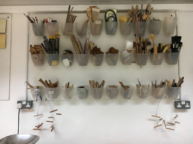
Here is a pic of Julian Stair's ceramic tools, an inspirational metaphor for how organised I wish to be in the coming months.