29 April 2016

Gems in Transit

Note: Annoyingly blogger deleted all the content of this post, so all my words have gone out the window! I will try my best to rewrite, but apologies if its a bit short/muddled, I'm very behind on blogposts!

So for this term, we had to choose two modules, one of which was a two-day workshop called Gems in Transit. The project focuses on gems and their influence across chronologies and geographies. For the most part, the two days consisted of presentations from scholars from many different places talking about Mughal gems, pearls, and crystals. Their topics related gems to themes about power, gender, knowledge, collaboration and technology - it was a fascinating insight into their project, and I look forward to reading their papers when they are published.

There were also some more practical aspects to the workshop. After a morning of presentations, we had the opportunity to handle some of the objects with gemstones from the Metalwork collection.  The spread started with a point cut diamond ring from the 1500s, all the way to a 20th century equivalent brilliant cut diamond cluster ring. 

I took some pictures of my favourites which vary from minimal sophistication to outright gaudy fabulousness: The first was a beautiful bloodstone box, made in Paris around the mid-1730s,which is actually a deep, rich forest green (it's a bit rubbish in the pictures). It almost doesn't seem to really be gemstone, but once opened and you could see the translucency of the stone it just made it all the more exquisite. The second image is of a Victorian diamond ring, with three rose-cut diamonds. It looks strikingly contemporary, which makes me wonder whether it has gradually seeped back into fashion in the jewellery world (this is especially as jewellery designers have been able to have further platforms to open up the design process via social media...can't help lusting over Digby & Iona's instagram just as one example). Apparently the rose-cut was surpassed by the brilliant cut because the brilliant cut enables  light to refract more efficiently inside the diamond, thus giving it a striking sparkle. The last is an outrageous Victorian brooch that incorporates diamonds, garnets, topaz, turquoise, spinel and amethyst. Nevertheless, it left us gemmies all lusting and sparkly eyed for our very own blingy bits.


The next activity was to cut some gems ourselves. We all ventured to Blythe House together to meet Nicholas Yiannarakis, a jeweller and gem-cutter who also teaches lapidary at Holts Academy in Hatton Garden. He brought in a domestic set of machinery for cutting and polishing gems, and a handful of stones (albeit not as precious as diamonds or emeralds) for us to play with. We were given a selection of jaspers, agates, and quartz and shown how to cut with a tiny jigsaw, and polish with a teeny sanding belt. All of the machinery had to incorporate water in order to keep the stones cool, so it ended up being quite a messy task.


Although it was quite a fast turnover for a workshop, it was very enriching to do something practical. What has been great about this course so far is the value that is placed on both the practical and academic, and that in many case they are one in the same piece of research. It makes me feel that my previous experience helps a lot with this course, and thankfully my colleagues are also super active and eager to initiate and get involved with projects that enjoy a multi-disciplined engagement.

Now, I'm off to beautiful Liverpool for the bank holiday, have a lovely long weekend!

09 April 2016

Fashion and Translation: A new look

This Tuesday was probably the first time I had picked up a pen to draw with in a very long time. I signed up to help rework a website for East Asian Fashion that my tutor and previous students had worked on, which had after a year or so, lost its way in terms of both design and organisation. I was put to the task of reworking the logo and producing some kind of background, to at least start thinking about making the whole thing a little bit more cohesive. We were given a whole bunch of materials to work with, to give up a little bit of a starting point, but otherwise really beginning from scratch.

Imme, Olivia and I came across photographs from the project of a workshop making buttons for Chinese garments, using silk knots. We thought that would be a good starting point for some imagery to work with. We wanted something fresh, clean, and most importantly something that wouldn't be an immediate stereotype i.e. embroidered dragons. I started looking at Japanese, Chinese and Korean garments, especially how they were fastened, and found that knots were a key part of the coming together of a garment. Whether its the way an obi is tied, or how a hanbok is finished with a knotted accessory, the knot seemed to be a small detail we could use to bring the subject together. Rather apt really!


As an East Asian subject, it gave me an excuse to go back to ink. It is my automatic, go-to material, but I felt like I had an excuse to indulge. Although I wanted something bold and strong, I also wanted to make sure there was a sense of natural, ethereal flow. I wanted it to be neither overtly feminine or masculine - although the logo is like a ribbon, I think that it is off-centre enough to disrupt the feminised and child-like connotations. The red is quite centred between orange and pink, which is reflective of a colour that is valued in E Asia, but also helps to de-gender a little.


Then, I got to have some fun with surface pattern. I decided to repeat the silk buttons, which come across as almost abstract. I felt like I needed something to give some texture and depth, while also not taking away from the text that will come later. I couldn't help but put together some really bright and daring colours...its too tempting. But for the practicalities of the website, I used a two very pale greys, which works very well with the red, but also is quite sophisticated... I'm hoping it won't end up being too corporate. It's still all work in progress, but I think I'm pretty happy with this first result!


Some Relief: Anomalisa Review and a quick trip to the Museum of Childhood

I realise I am now two blogposts down so I honestly will try my best, but I am really knackered, so bear with me if I am a bit waffley/or have zero to say at all.

So some of you may know I finished my essay when I wanted to on Monday morning (yayyyy!) and it was safe to say I was bloody relieved to get away from it, just in time for a city walk with the wonderful Angus.

Tuesday, I had some time to work on some design work that I'm helping with (a blogpost will follow imminently!), which was really just a relief to do some drawing for once, and I will be bringing a sketchbook with me to Vienna - we're going on a school trip there in two weeks so its going to be a lot of fun! I'm looking forward to experimenting with some drawing/writing in the same book, which I think will produce some interesting documentary material. I've never really tried it before since sketchbook days at Foundation, and I really resent uni for putting me off using a sketchbook. It's about time I picked one up again, just for my own practice, whatever that practice is.

Wednesday, Rosa and I finally got to see each other after a really long time. With both of us still working on our respective projects, its been difficult to keep up but we finally had a day together which turned out to contain lots of elements of stop motion.


First we went to see the new Charlie Kaufman stop motion, Anomalisa. I had been really looking forward to it as I'd heard good reviews and really wanted to see how it was made. Technically, we both agreed that it was very impressive. The facial expressions were made out of several parts, a part for the upper part of the face for the movement of eyebrows and eyelids, and one of the lower part for the lips. The bodies were quite realistic, and the movements incredibly smooth. Equally we enjoyed how they had used these material aspects within the storyline; there's a part where the main character's face rapidly changes, and falls off, showing why they used stop motion instead of live-action for the film. But the good parts end there really - the storyline was rather disappointing and frankly quite annoying.

They started off very well, really emphasising the mundanity of the story. Only about 10/20 minutes into the story do you realise that everyone aside from the protagonist, Michael Stone, has the same voice and the same face. The film hits a climatic part when Michael hears another voice, the voice of a young woman called Lisa. They have weird puppet sex, and then he dreams that all the people with the same face are all completely in love with him. When he wakes up and proposes to leave his wife for Lisa, she suddenly starts transforming into everyone else. It ends with Lisa writing him a letter, and as the camera pans up to see Lisa and her friend in the car, you realise the friend has another different face. So at the end of it all, its still a film that is all middle-age-white-man-puppet having a crisis, boo hoo.

The film could have gone super surrealist, there was so much opportunity for the film not to be like that. It could have been all apocalyptic or something, anything more than just same old story surely?! It also didn't continue having a reason to be stop motion animation, and its a shame all that effort went into such a rehashed story with neither a sombre afterthought, or an exciting fulfilment.

So we moved on, and with a few hours to kill before we met Hanswan, we popped over to the Museum of Childhood for the mini Smallfilms exhibition. Ahh, some proper, hearty, imaginative stop motion. I remember loving the Clangers, so it was great to see and read about the detail that Oliver Postgate and Peter Firmin went to. Also Peter Firmin is superbly skilled, those Clangers are knitted, with a mechano skeleton! It reminded me that making a great animation is not always about swooshy technical skills, it is mainly about a great story. The best thing about stop motion, and animation in general, is that the world is your oyster, you can make anything happen. You can make people fly, animals talk, walk, be on the moon, anamorphise a car, even with human figures, you can reach a fantastically intimate and emotional level that is humanistic and yet different to film...Why waste the time and energy on a terrible storyline? So although these stop motion animations both have two very different audiences, it is clear which one is the more compelling...


Anyway, a little trivia, Bagpuss was supposed to be orange and white, but they sent pink by mistake! To be honest, I'm glad they went for it! And for some nostalgia (or a new discovery for some of you who've never seen it before!) here's the first episode of The Clangers.  I understand there is a new version (??!) which I've not seen yet, but I hope it lives up to its original counterpart!

27 March 2016

Second Essay Research: Made in Hong Kong by Fruit Chan


I know, I know, I'm a blogpost down and so we shall skim over that detail, and hope that I remember in the next week that I need to top up...

So this blogpost is actually cheating a bit because I'm going to call it research; I find it much easier having something to 'talk to', if you like, rather than feeling weird writing informally on a word document.

By way of finding something 'visual' to grasp on to for this essay, I thought that watching some films would be a great way to put myself within a time and space in Hong Kong so that I can get a feel for the atmosphere. The main thing I wanted to avoid was anything too 'Hollywood' if you like, as of course Hong Kong cinema has had a remarkable global enthusiasm. But I was looking for something that could speak about life in small spaces, in a time of anxiety that could in some ways, be honest. Some of the reading I had been doing recommended Fruit Chan's Handover Trilogy, which turns out to be some legendary Hong Kong independent cinema. Most importantly, it was specifically commenting on the anticipation of the 1997 handover (hence its title) in the 'present', i.e. Made in Hong Kong, the first of the trilogy, was released in October of that year.

In terms of space, and the visualisation of a HK space in particular, cinema is a way to observe a dramatized version of this space. It nevertheless, can tell valuable narratives, not only in the physicality of the space (hyperdensity, the crossover of public and private in the ‘home’, establishing what ‘home’ looks and feels like in HK) but also the atmosphere, the tension, the relationships held and let go of, in the interiors of the space. What I have found frustrating so far is the lack of these sorts of sources, and thus outside of personal and interpersonal experience, cinema is ideal for showing a critique of this space, especially in a film like Made in Hong Kong, with Chan's cinematic style that is supposedly considered 'realistic' in comparison to the dramatic, globally successful triad/corruption-focused, showdowns. Okay, Made in Hong Kong still has these elements too, but it isn't simply good-versus-evil.


Made in Hong Kong shows several things about HK which I myself have not had experience of. Alongside my parents' description of their childhood apartments, having the visual in the filming in a real apartment really put across the way people lived together. Although the units seem to only have tow or three family members living inside, the apartments were/are so so so so small. Few solid doors were opened or closed; instead were just gates or sliding curtains or flimsy, plastic sliding doors. The way the movie was filmed inside the apartments in terms of cinematography was clearly also restricted, often choosing very close shots or shots framed with doorways and furniture, no doubt because of the limitations of the space anyway. Far away from the vast apartments on the Cantonese soaps that frequent HK television, these units feel cramped, bleak and incredibly ordinary (so lived in and chaotic, yet ordered in its own way) that you can't help but feel you have entered something so unashamedly real. Coming out of the apartment, the housing estate is an endless vertical cavern, interconnected with tunnels of concrete, not unlike a multi-storey car parked; It feels like a place where people are 'stored' only for a few hours, but at the same time, its prison-like too. All the same, the characters don't come across as 'trapped' by the architecture as such, but more lost. Outside of the estate, there are few points in the movie where you can come up for air from the urban landscape. Only two spaces feel open: the rooftop of a building, facing a huge cross, where at the beginning of the film an anonymous teen girl commits suicide by jumping; and a view over a mountain-side cemetery, where the three protagonists call out the girl's name into the foggy distance. The message here seem clear that there is no way out, that fighting the way of life is futile and will only result in death. It is not the architecture that keeps everyone in, but life itself.

The characters and storyline are similarly cynical. The main protagonist loses all of his family, his friends and all purpose in life. He can't even succeed as a bad-guy, failing to even to avenge the deaths of his loved ones. It is only at the brink of madness that he is capable of killing, and then ending his own life, fulfilling the prophecy that Chan seems to be making. Any dream of happiness, wealth, success, escape is very swiftly extinguished. Of course it is biased, exaggerated and sombre, the vision of a young aspirational director in Hong Kong, but what it does show is this other side. It may be 'gritty' and hard hitting, but I don't feel that it pretends to be a flashy action movie showing slummy apartments as the backdrop, nor does it give a glossy, saccharine finish on HK life, as though there exists a Hongkongese dream. I hope to use this film with a pinch of salt. But it does give a great insight into the life and lifestyle of HK people in very recent history, with a view of the impending 'doom' that they fear in Chinese rule.

17 March 2016

Botticelli Reimagined Review

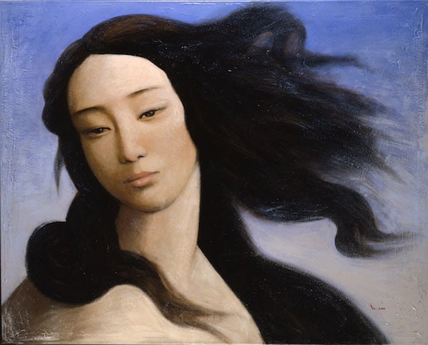
Venus after Botticelli by Yin Xin

Sorry for another late blog, but alas, some weekends are not meant to be, especially coming down after the WIPS and crawling back up again. The WIPs went pretty well (as some of you from my course might know) and it seems to be just a case of cracking on which, of course, I have been struggling to do thanks to all the other exciting things that I can't let go of...Such is life. I'm telling myself that tomorrow will be the day, and I will work from home so that I don't get distracted.

In the meantime, I thought I would quickly whiz through my thoughts of the Botticelli Reimagined exhibition (lots of reimagining going on, don't you think?). In spite of my busy-ness, somehow I told myself I had time to do this on the opening day with Chris and Hannah. I'll be frank - I thought that they had overdone it and lots of bits felt like fillers, probably because it is in the biggest  exhibition space at the V&A. As a 'modernist' though, I loved a lot of the first room holding the 'Reimagined' bit, and much of it was incredibly impressive, sometimes accidental, interpretations of Venus, and it had a lot of potential for interesting debates around gender, sexuality, the sexed gaze, beauty, etc. etc. and yet, I personally was disappointed with the texts on the walls and descriptions of the works. But for now, I'll talk about the pieces I liked.

There were two stand out pieces for me, which immediately made me think about how the beauty portrayed in Botticelli's The Birth of Venus has penetrated contemporary visual media; the first is an outstanding painting by Yin Xin, which of course caught my eye as one of the few Asian artists involved in a very Euro-centric (of course) exhibition. Obviously, Venus portrays a Caucasian ideal of beauty, but I found this one of the most captivating pieces in the whole exhibition and wished there was more content or context so that it could really push its agenda. From Yin Xin's series After, which is a series of paintings that visually changes figures from very famous European paintings to ethnic Chinese, clearly Yin is trying to problematise this historic conception of European female beauty, magnified and idealised in these idols portrayed by European men. I felt like more emphasis would have globalised 'Reimagining' much more clearly than what had been shown.

The other was a display of two photographs by Rineke Dijkstra from her series of Beach Portraits, which apparently was not intended to look like interpretations of Venus. There is a beautiful innocence to these pictures, especially the one I have included below. The poses of the two girls are strikingly close to the painted pose of Botticelli's Venus, and does make you question where these influences, if any come from. Clearly in Venus it is a male gaze (Botticelli) forming a female figure with a combination of sexuality and youth. But I feel the intention here is different, and I think it makes you think about Venus herself as an adolescent girl, on the cusp of...something - it is neither womanhood or adulthood or even girlhood. I feel like the two photographs really revealed something about our gaze as an audience of young girls, a very contentious subject which the Dijkstra didn't seem to intend. Yet in the context of the exhibition, it brings out these very complicated relationships between the historic and contemporary views of girls and of ourselves. 

After that, I wasn't massively impressed until the end room with two studies of Venus, two beautiful luminous, full body portraits of her. What was fantastic was being able to compare the two studies, noticing a fuller body, a different hairstyle, the slight tilt of the arm or the leg, which you never get to see with such famous paintings. Its great to see a process, maybe a 'vulnerability' in a work in progress, from what seems like a man who is intent on a specific beauty.

Beach Portraits by Rineke Dijkstra


05 March 2016

Second Term Essay: Hong Kong's outdoor dining


In preparation for the WIPs next week, perhaps its relevant to introduce my research topic, although I'll keep enough back so that all of you from my course won't get bored on Wednesday afternoon....

For this essay, we have to follow a design change or development through a critical historiography, which is in itself a difficult thing to grasp. It is a much less tangible task than the first essay, as of course we could always come back to our object if we veered off course but this topic was much harder to pin down. We had to choose a time period and location to cut down on the crazy amount of material we might potentially have to deal with.

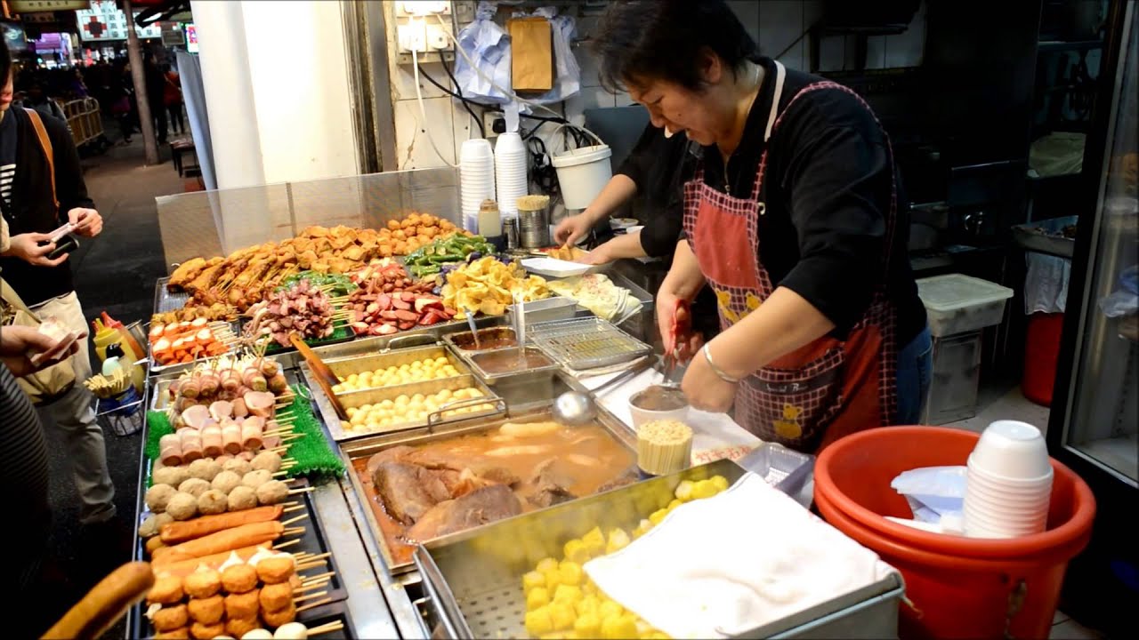
I at least knew that I wanted to focus on Hong Kong, which visibly has had a significant change in the landscape in recent years, so something must have happened. So I decide the best thing would be to ask my parents. It seemed that they were in a good position to identify the everyday changes that had taken place in the last few years, as they had had some distance with the place, but visited often enough that they could see the smaller effects of the bigger picture. They felt (as food is of course, very important whenever we visit) that the most noticeable change was the decline in a kind of eating place called a dai pai dong, a very informally set up restaurant that feature fold up tables and plastic stools, and serve up a small selection of heart seasonal dishes. No fuss, but always great food. These venues serve up breakfast, lunch and dinner, or also the late afternoon snack with a Hong Kong milk tea or a can of coke.  They suggested the area of Mong Kok in Kowloon, as a place that I recognise myself, but also as an important consumption district in Hong Kong. These were not only a big part of the growing up of my parent's generation, but also pepper my own memory of Hong Kong. I also wanted to include the street food hawker in the conversation about dai pai dong, as in my view there is something about them that really relate. They serve similar foods, have similar kinds of patrons and occupy the same kinds of spaces in Hong Kong. Both have a temporality that I don't recognise in other kinds of eating venues in Hong Kong.

This had all changed a lot even since I had been born, so I chose my time period as between 1997 until now, knowing that the handover from Britain to China is a crucial point in Hong Kong history. Naïvely, I had only really chosen it to be a consistent politics but of course this has really developed with learning more and more about the political landscape of both China and Hong Kong at that time. 

In early February, I thought my design change would be relatively obvious, focusing on the street and change in urban planning. I felt like this was already a pretty expansive topic with plenty of challenges for me to practice dealing with. But then the day after the proposal hand-in, riots broke out over the police removal of street vendors in Mong Kok. From the riot, and previous protest activity in Mong Kok, it clarifies that these streets and its activity is much more that the change in urban planning. The change is also in the people; they are further vocalising their feeling towards government changes to their territories and therefore their identities. Food is essential to the everyday life of Hong Kong people, and it is clear that the way in which they eat together, often at these informal outdoor venues, are a huge part of their collective identity. It really shook me that I had chosen something that was so current, and I think I worried that I didn't know enough to talk about this coherently and intellectually. Further research and just finding as many sources as possible, and talking to some specialists on Hong Kong and markets has really helped though to settle that insecurity, and so hopefully this week's presentation I can get some feedback in how I'm dealing with it so far. 

It's still unclear how I'm going to structure this so that it is easy to understand through design history, but hopefully this will come with more time with my material. I feel like I also have the advantage of my parents, in that they, and myself, have first hand experience of these social gatherings around dai pai dong and how it has effected even our experience of Hong Kong. Spatial issues are of course intrinsic to the workings of a city, and perhaps is even more magnified in the special conditions that Hong Kong is under, not only tiny, but also with such a specific historic relationship with two different countries and cultures.

Fingers crossed for me on Wednesday! Hopefully this is a satisfying taster (couldn't help it) for the essay to come!


28 February 2016

Reimagining Objects: a History of Design Exhibition


This week was the opening of our exhibition 'Reimagining Objects'. The purpose of the exhibition was to express our research for our object essays through a new interpretation of our object. We felt that seeing as many of the objects we researched will never be displayed, because they're too delicate or broken, we really wanted to open up the archive in our own way.

I decided not to interpret my own object, although that might be something I do as a later project. Instead I worked with my friend Natalia, who wanted to animate her board game, 'The New Game', a kids game based on the Crimean War. In her research, she explored the surrounding media of the Crimean War in Victorian Britain which not only included newspapers, but also theatre productions, songs, and even 'holidays' to the front to watch the battle. Clearly the documentation (and exaggeration) of the war was relentless and totally indifferent to the violence that was occurring. The board game was a part of this,  disturbingly set against the domesticity of a child's playroom. The game itself is simple enough, with two swirls of ocean with the port of Russia and Turkey being the aim of the two sides. The game used a teetotum, an acceptable version of dice for children. The counters were also miscellaneous so that you could use them for different board games. The game is unbiased; it doesn't matter which country wins. The war is even accessible for children.

It was this juxtaposition that we wanted to try and capture in our animation. We went for a photographic stop motion technique and 3D props in the corner of Nat's living room, in true DIY style. We used paper boats made from sheets of the Illustrated London News as counters to represent the two fleets of ships that eventually move on their own. But once the 'war' is won on either side, the player intervenes and destroys the paper port. The story begins again but with the alternative ending, playing in the exhibition on a constant loop. The idea was that we would depict it as a childlike parody, an kitsch film that's cute, whimsical and harmless, but is also representing the darker side of the time, a sick fascination and entertainment from the bloodshed of the war.

At the exhibition, we projected our animation on one of the walls along with a demonstration of the game available to play on the opening night. We had a fantastic time doing this project on the side of all the million other things we all have to do, but it was all totally worth it! The exhibition was really rewarding and we're all really proud of what we have achieved. None of us pretended to be artists or designers on order to reach a final outcome, but really wanted to use this experience as part of the process of research. It was really nice for me to be able to use what I've learned on my BA course, and I'm really enjoying the combination of what I love within this course. It shows that it is totally valuable to have all these skills, you don't just have to focus on one thing.

See the animation here.