I decided to take a sketchbook away with me again this year, to try and get back into drawing again. It has been a long time since I've drawn on location, and it's taken me some space and time to enjoy it again. This sketchbook ended up being half empty, but looking at it now several months after the trip, I find it much more peaceful, and pleasing, to look at. As you can tell, I didn't end up drawing very much in Chicago... I think I have gotten sick of drawing the city, skyscrapers and structures, preferring to take photographs instead.
From Chicago, I flew to Salt Lake City to meet my parents, and start a two week drive through Grand Teton, Yellowstone, and Mt Ranier National Park. Somehow in that two weeks, we managed to experience four seasons, heat, heavy rain, snow, the lot. I'm not sure if I really reflected that much, but I enjoyed drawing trees and mountains, and just getting my hand used to moving to depict what I'm seeing again. I brought materials with me, but I ended up also using found materials; at the time, Yellowstone was experiencing one of its annual moving forest fires, and we passed by a spot where the fire had burned through. The experience of walking through the forest was just awe-inspiring, and at that point I had to pick up some charcoal to try and draw what was around me.
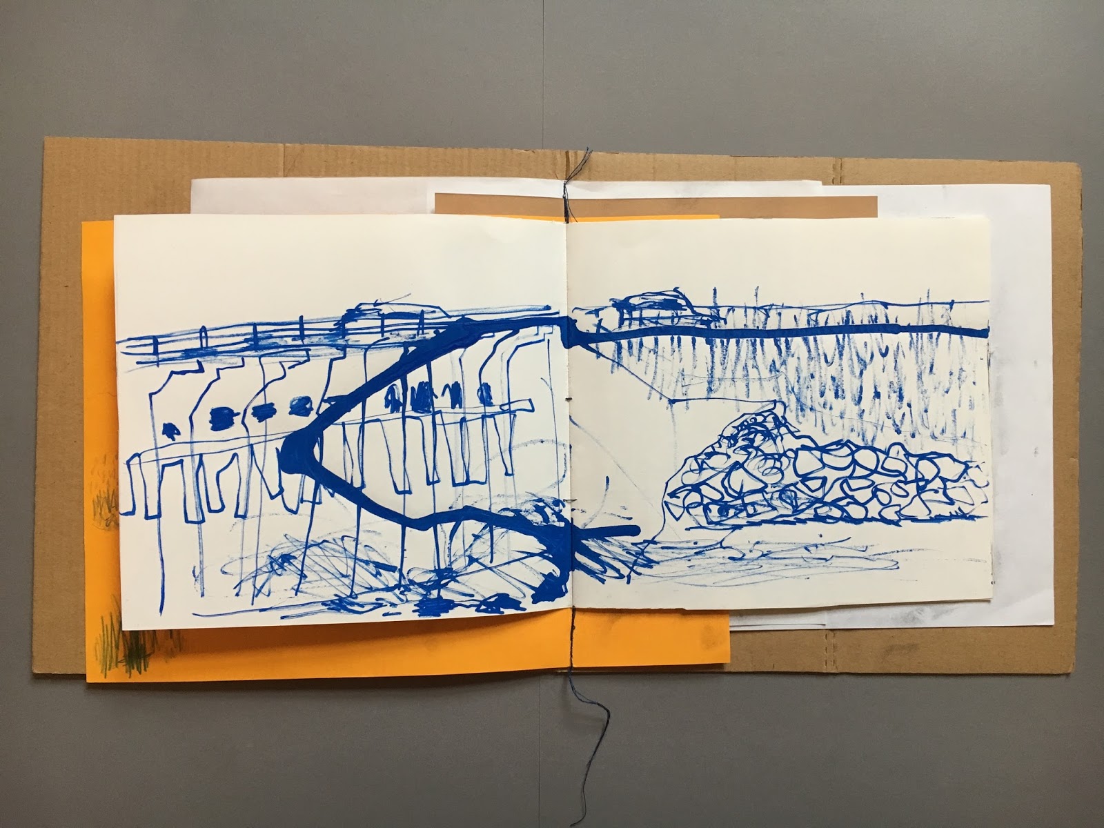
In hindsight, I wish I had brought bolder and more colourful materials so that I could make more graphic images. My favourite page ended up being of a dam in Grand Teton, using a paint pen that exploded. It ended up giving an energy that I really enjoy making and seeing in my work, so maybe it means next time I need to use even more wet materials.
From what I remember, I didn't enjoy the experience of facing drawing again, but I think that it was worth breaking that anxiety now rather than later. I want to learn to love drawing again, so I think I will need to carry on challenging myself in this way to overcome it properly. It was freeing to know that it wasn't going to get judged by anyone, it wasn't going to receive a 'Satisfactory'. Let's see what happens this year on my next trip.
Showing posts with label Vivien Chan. Show all posts
04 January 2017
30 December 2016
September: Chicago Art and Design
September marked a long-awaited trip to the States, a crazy three week stint for me starting with five days in Chicago. J has an aunt living in Chicago, and this year marked 20 years since his first visit to the city, so it was as much a reunion as it was an introduction for me. I was excited to spend some time seeing Chicago's art and design scene, although again, I had lacked time to do much real research. Our days were limited, so a top priority was the Art Institute (of course) and the Architecture cruise through the city.
Unfortunately, we had to be in Chicago while the Design wing in the Art Institute was closed, so all that was on offer was a tiny room by the cafe with a bunch of modernist chairs...beautiful as they are, I mean, yawn. I was hoping for something more invigorating, not least local!! The other design bit was a little 20th c. section with some great assemblages of furniture, but very dated labelling, so I'm sure they're coming round to that part as well... But thankfully, the modern and contemporary art sections were entertaining and beautiful, and for me, a little less self-conscious than the Tate. It had a whole plethora of stuff displayed together, well designed spatially, and colourful! I also think I'm more of a Matisse gal than a Picasso, because I ended up taking lots of pictures of them. However, I would say the cherry on top of the cake was this little piece we found by Karel Appel, to bring us back around to mine and Hannah's trip to Amsterdam! It made me want to look into him again, as I can tell that I'm immediately drawn to his work because I recognised it straight away!
Terribly we ran out of interest for the rest of CAI (tut, tut, tut), and I knew I wanted to at least see some of the public art that Chicago is famous for. I didn't expect to be so impressed by Calder's Flamingo because I'd seen so so many images of it already, but it was for me the most breath-taking, and was a really jubilant contrast to the somewhat sombre, corporate modernist architecture around it. As glittering as they are, I can only cope with it for so long, and when it is juxtaposed with a giant red thing with different shapes and curves, it reminds you to be excited. I was somehow less mesmerised by the Picasso, in part because of the terrible lighting in that corner, but probably because of this lack of fun that I enjoy in his other work and sculptures (namely the loveliest one in NYC that Hannah and I stumbled upon).
As the sun started to set, we ventured back to Millennium Park to catch the final day of the Jazz Festival, in the glorious setting of the park surrounded by shining towers. The pavilion was lit beautifully for the show, showing off its dynamic lotus shape. By the end of the day I was knackered, and looking forward to sleeping, but nonetheless enjoyed the excitement of live music in such a setting!
That's it for now. Hopefully there'll be another blogpost to come about the trip when I finally get my films to the developers... and a sneaky sketchbook in tow too!
Labels:
ARCHIVE,
Exhibition,
Trips,
Vivien Chan
11 June 2016
London Craft Week: Wang Dongling Calligraphy Performance
This post was written for the Design China blog, which you can see here.
On the 6th
May, The British Museum welcomed the world-renowned calligrapher Professor Wang
Dongling for his first public performance in London for this year’s London
Craft Week. Taking centre stage in the Great Court, four rolls of paper were
laid and taped onto the marble floor at the entrance of the museum, where a
crowd gathered in wait of a performance by ‘China’s greatest living
calligrapher’.
Wang took a slender brush in his
hand, a sixty-centimetre-long bamboo handle with a short drop of hair, and
dipped it into a red bucket. He wore an all-black outfit with bright red socks,
matching the bucket of ink. Beginning in the top right hand corner, Wang starts
to paint; he holds the brush but the very end of the handle, his body in a
constantly hunched position, knees slightly bent. After a few characters,
written vertically on the page, Wang walked back up towards the bucket to
re-ink his brush. The pace is efficient, confident, perhaps less sentimental
and more calculated than I imagined the process to look like. The ‘mad cursive’
script is difficult to decipher – the characters become abstract lines and
gestures, pulling out the traces of the body from the painting.
We were lucky to witness such a
large piece. In contrast to his wild, heavy works with enormous brushes,
finished in one swooping round of black, this piece felt bird-like, fluttering
and dainty with its small characters on a vast page. This piece took time. A meditative
hour was created in the hot and noisy atrium, with Wang solely concentrated on
the calligraphy as we looked on in awe. He didn’t even stop for water. The
lines fade in and out of focus as the ink dries on the brush, forming an
undulating surface from the paper. The occasional swift flick of the brush for
elongated characters surprised the audience, bringing his movement back into
focus.
Labels:
ARCHIVE,
Design,
Exhibition,
Practitioners,
Thoughts,
Vivien Chan
01 June 2016
London Craft Week: Contemporary Chinese Craft
This post was written for the Design China blog, which you can see here.
As part of this year’s London Craft Week, the China Design Centre hosted two exhibitions displaying an array of work by both established, and up-and-coming Chinese practitioners. The gallery space is hosting one of them; ‘Jingdezhen Ceramics – The Next Generation’ brought together by The Pottery Workshop. The Pottery Workshop was established in Hong Kong in 1985, but have since expanded to four other locations. Jingdezhen, has its biggest facility, and has become a hub for a community of craftspeople in the renowned ‘Porcelain Capital’. This exhibition displayed some of the finest and most innovative works from Jingdezhen’s Pottery Workshop, from illustrative sculpture pieces, to minimal contemporary art objects.
Several large works are included in
the show. Caroline Cheng, the director of The Pottery Workshop, displays a piece
from her series ‘Prosperity’, an outstretched silhouette of a bell-sleeved robe
made of a swarm of minute, blue ceramic butterflies, with a single white
butterfly. Cheng describes her work as a metaphor for China, as a gathering of
unique personalities and cultures coming together to create; both the detail
and the whole are significant. The ceramic garment hangs to the side of the
room, overseeing contemporaries in the exhibition.
At the opposite side of the room, the furniture by July Zhou and J Design present witty interpretations of Chinese contemporary ceramics. Two chairs consist of a dark mahogany frame, holding the unusual bowl-shaped ceramic seat, decorated with bamboo painted in the traditional colours of blue and white, but with added flecks of red. A traditional icon of Chinese calligraphy translated onto ceramics is cleverly transformed into something unexpected. Displayed aside is a chair and table set in the style of Ming furniture, only wood is replaced by transparent lucite, bringing to the forefront historical references in a contemporary setting. What might have been decorative wooden panels in the back and seat of the chair, and the centre of the table, is replaced with dark blue ceramic tiles with decorative white illustrations.
Smaller ceramic objects dotted the
room with a variety of styles, techniques and approaches to the material.
Colourful splatters of ceramic fold into organic, cowrie-shell forms in Bian
Xiao Dong’s ‘Cocoons’, in a delicious combination of pink, lilac, mint and acid
yellow. In a similar vein, Lu Jin’s collection of vessels create a row of
pomegranate shapes, with gently hammered surfaces and golden crowns. Some
objects were more illustrative; Perched on a shelf are Li Zhen Ming’s
pandemonium of miniature parrots, with fluffy white feathers and pink features,
in different nesting positions. The most narrative in the exhibition is the
collaborative work of Ouyang Liang and Guo Zhen Zhen, a crowd of ceramic
characters collectively called the ‘Monkey King’. Several androgynous figures
look as thought they are swaying to a distant tune.
However, among my personal favourite
selection for the show was an assortment of brushes by Yang Dong Mu. Although
an unusual addition to a ceramics show, it highlighted the interdisciplinary
function of the Jingdezhen Pottery Workshop, which supports an array of
craftsmen as well as ceramicists. Framed in the corner of the room, the brushes
and their accessories were also examples of contemporary reimaginings of
traditional Chinese craft, using natural forms in bamboo to guide the shapes of
the brush handles and rests. The exhibition overall, demonstrated the vast
understandings of Chinese craft within one of the China’s dynamic arts
communities, combining new and old, nature and machine, into work that is
refreshing and distinct.
As part of this year’s London Craft Week, the China Design Centre hosted two exhibitions displaying an array of work by both established, and up-and-coming Chinese practitioners. The gallery space is hosting one of them; ‘Jingdezhen Ceramics – The Next Generation’ brought together by The Pottery Workshop. The Pottery Workshop was established in Hong Kong in 1985, but have since expanded to four other locations. Jingdezhen, has its biggest facility, and has become a hub for a community of craftspeople in the renowned ‘Porcelain Capital’. This exhibition displayed some of the finest and most innovative works from Jingdezhen’s Pottery Workshop, from illustrative sculpture pieces, to minimal contemporary art objects.
At the opposite side of the room, the furniture by July Zhou and J Design present witty interpretations of Chinese contemporary ceramics. Two chairs consist of a dark mahogany frame, holding the unusual bowl-shaped ceramic seat, decorated with bamboo painted in the traditional colours of blue and white, but with added flecks of red. A traditional icon of Chinese calligraphy translated onto ceramics is cleverly transformed into something unexpected. Displayed aside is a chair and table set in the style of Ming furniture, only wood is replaced by transparent lucite, bringing to the forefront historical references in a contemporary setting. What might have been decorative wooden panels in the back and seat of the chair, and the centre of the table, is replaced with dark blue ceramic tiles with decorative white illustrations.
Labels:
ARCHIVE,
Design,
Exhibition,
Thoughts,
Vivien Chan
Subscribe to:
Posts (Atom)